Welcome to the second instalment of the Symbiosis Exhibition Stand Guide, our plain English steer on industry words and phrases. This time we’re looking at the language of stand design and print, from Artwork to Vector Images.
Artwork
You will probably be asked ‘Who’s doing the artwork?’ i.e. creating the images and words to be printed on the graphics panels that will cover the display walls of your stand. This may be handled by your in-house designer or design agency, if not our talented artworker will be happy to take your brief.
Brand Guidelines
These invaluable style manuals provide your stand designer with all your corporate standards to ensure complete uniformity and prevent brand dilution. They usually include how and where to use your logo, company colour matching (Pantone, CMYK, RGB) and proportions, as well as fonts and typefaces.
Bleed
It’s very difficult to print exactly to the edge so, to achieve this, it is necessary to print a slightly larger area than is needed and then trim down to the required finished size. Bleeds in the UK and Europe generally are 2 to 5mm from where the cut is to be made (1/8 of an inch in the USA). However it’s best to ask what information is required before providing any final artwork.
CMYK
A colour matching system that uses the four basic colours (Cyan Magenta Yellow Black) for printing colour images. For example C84, M100, Y45, K5 will print purple.
Copyright
Legal basis for the owner’s control of the usage of his image or artworks – always a good idea to double check before going to print!
DPI
Dots Per Inch is a measure of the detail or resolution of a print. In general, the more dots, the better and sharper the image.
Font or fonts
This is your corporate typeface or faces. It’s really useful for your stand designer and artworker to know all the approved sizes and styles to so they can use them where most appropriate. For example, if your Headline Typeface is Gotham the permitted fonts may include Gotham Light, Gotham Medium and Gotham Bold.
Formatting
This is where the approved artwork is methodically laid out panel by panel before it is sent to print – a good time for a final proof and copy check.
Graphics
These are the actual printed panels or sheets that will be used to dress your stand display walls.
Pantone
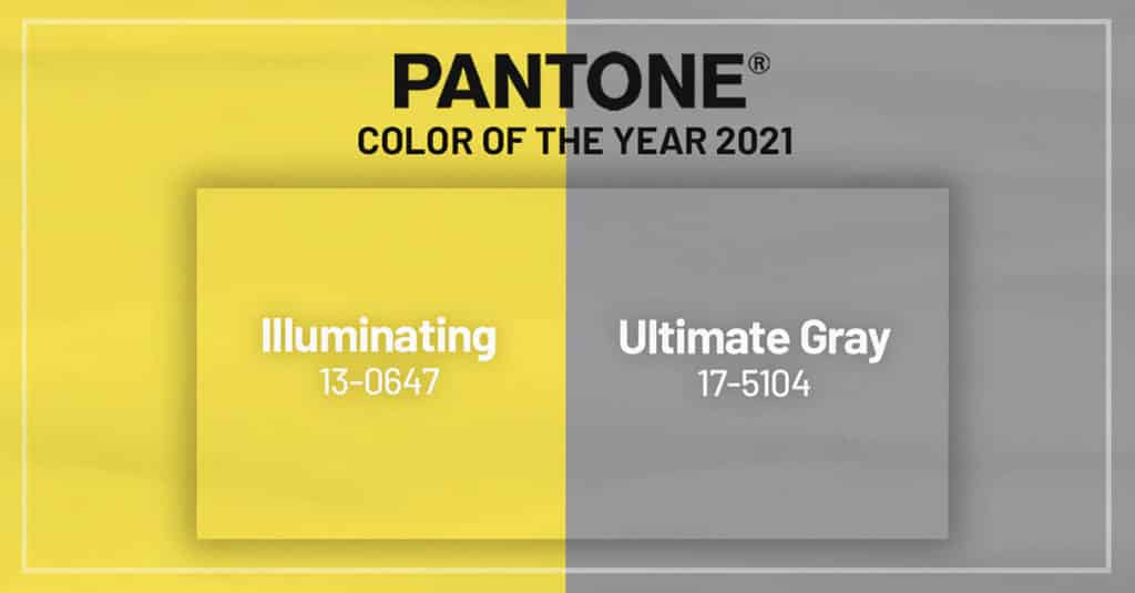
Possibly the most well-known colour matching system which uses reference numbers and letters. For example Pan 525 C will print as purple.
Pixel
Term derived from pi(x)cture element that refers to the simplest or smallest element of a digital image.
3D Rendering
This is what brings your stand design to life! It’s the computer graphics process that produces 2D images with amazing 3D photorealistic effects. So all the great detail, the shading, lighting and textures
RGB
(red, green, blue) is a colour matching system which is used for creating images on your computer screen. For example R83, G 47 and B100 will print purple.
Vector Image
Technically these are computer images that use mathematical descriptions of paths and fills to define the graphic, as opposed to individual pixels. In other words an image or logo that can be just dropped in, that doesn’t require changing to fit.
Had you read our first Symbiosis Exhibition Stand Guide? This STand Guide starts at the very beginning with general information and structural terms that you will find useful when buying space from the Show Organisers or having the initial briefing with your stand designer.


